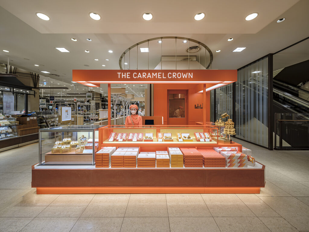
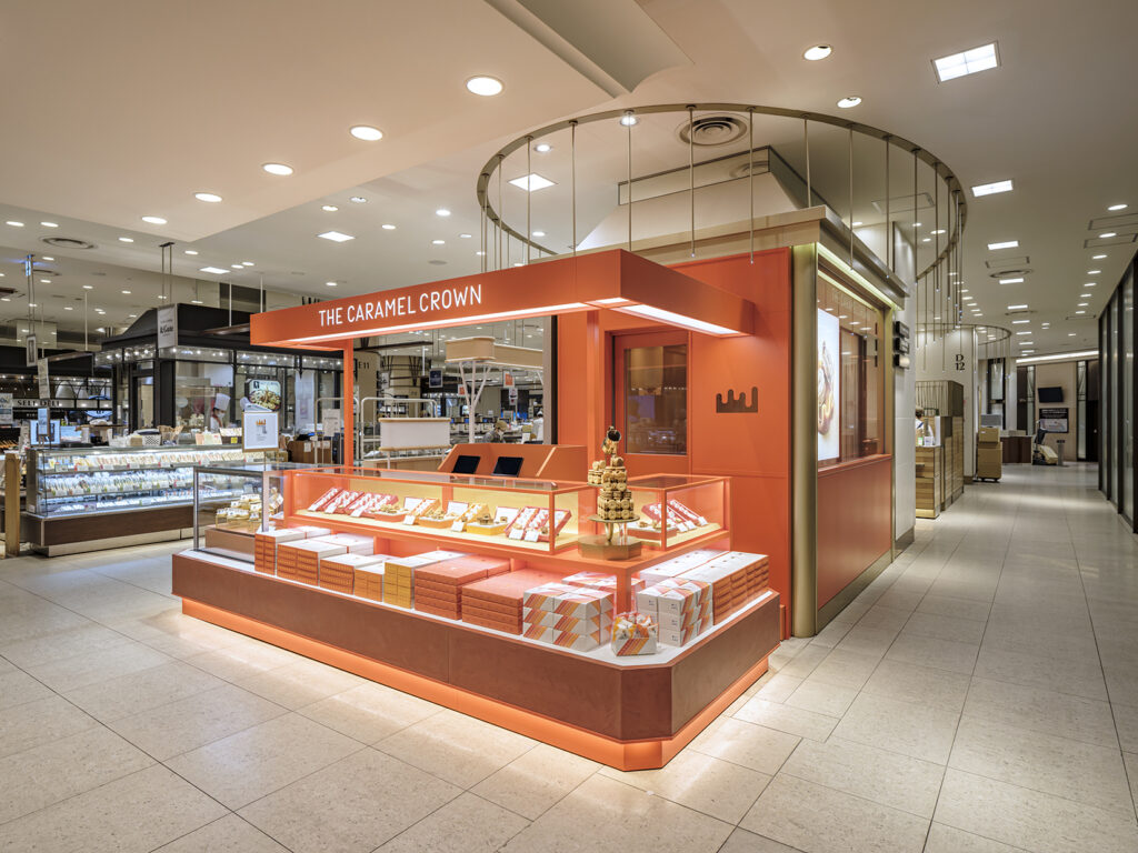
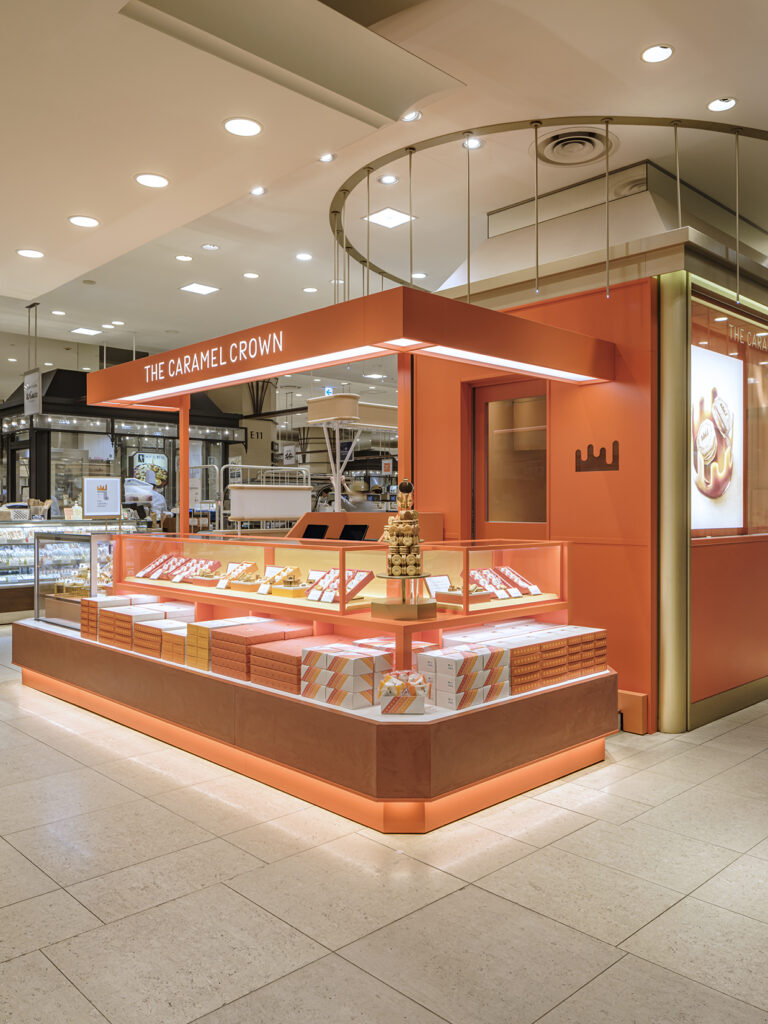
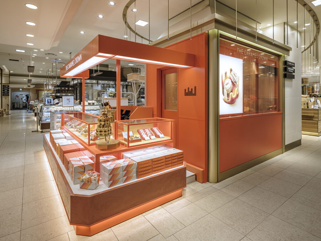
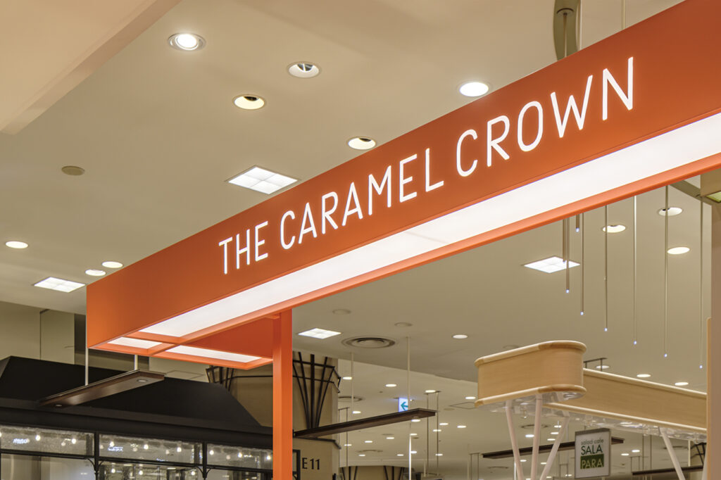
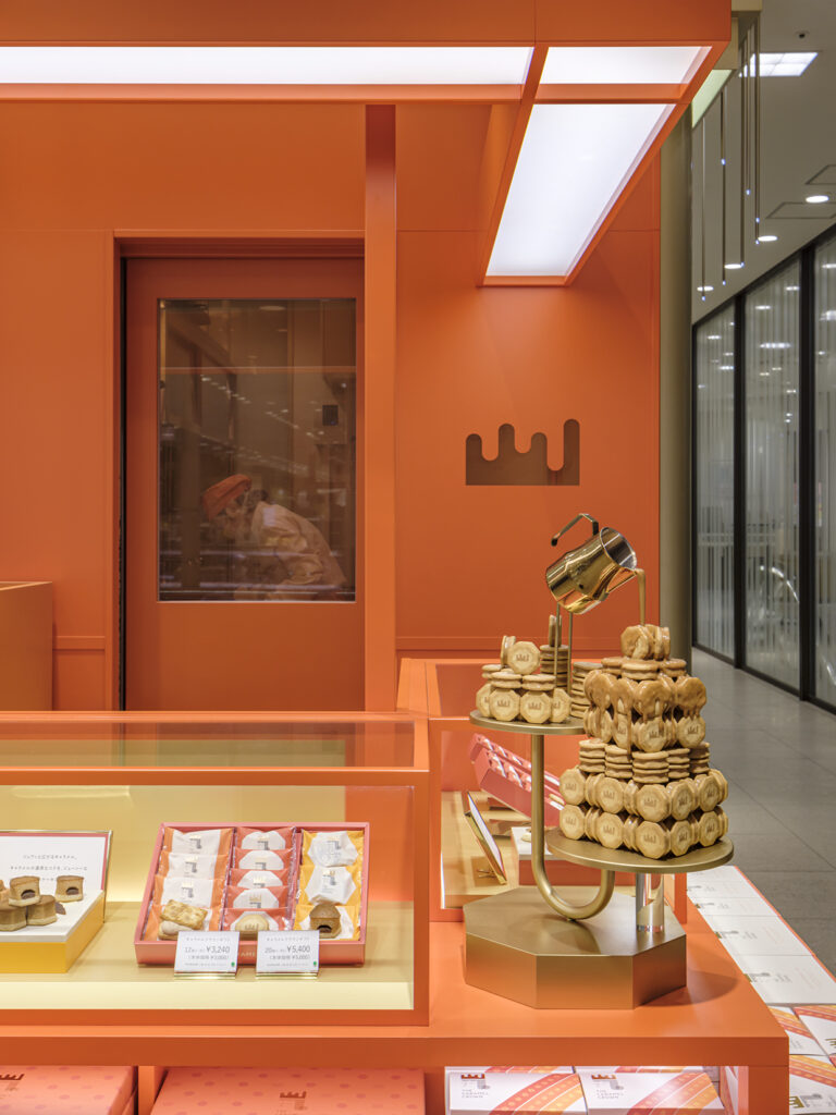
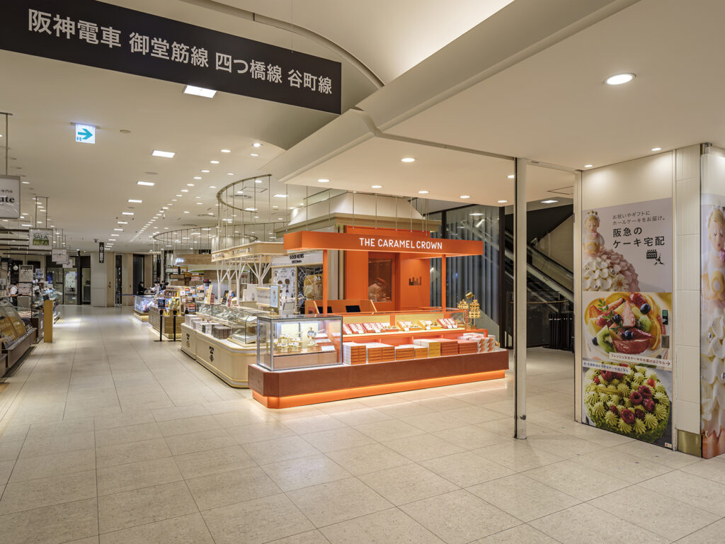
This is the store design for a new caramel confectionery brand launched by GRAPESTONE. Located on a floor densely populated with various food retailers, the project focused on how to attract attention and establish a strong presence within a competitive environment. As the foundation of the design, we aimed to build brand recognition by saturating the visual impression with a dominant use of orange—effectively making the brand’s identity both vivid and memorable. From a distance, the bold volume of orange color stands out, while up close, minimalist yet continuous linear elements subtly guide the eye. These lines contribute to a sense of coherence and flow throughout the space. To enhance the spatial density and add a distinctive texture to the brand’s visual world, we incorporated a Mortex finish dyed in orange. This material not only reinforces the visual impact but also evokes a soft, rich impression—resonating with the warm, indulgent character of caramel sweets.