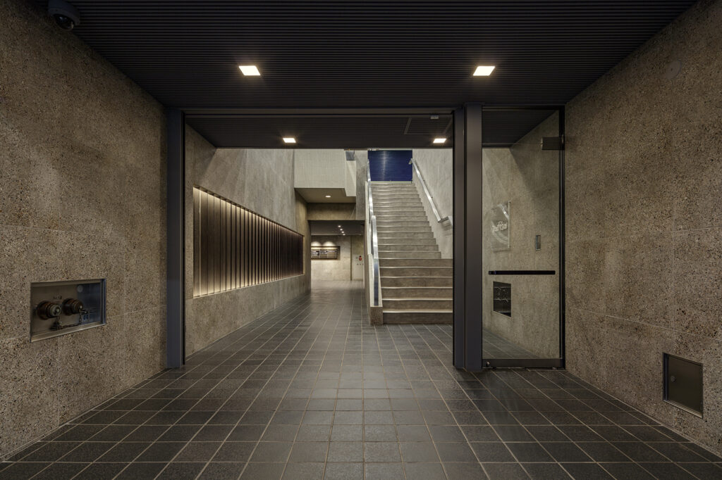
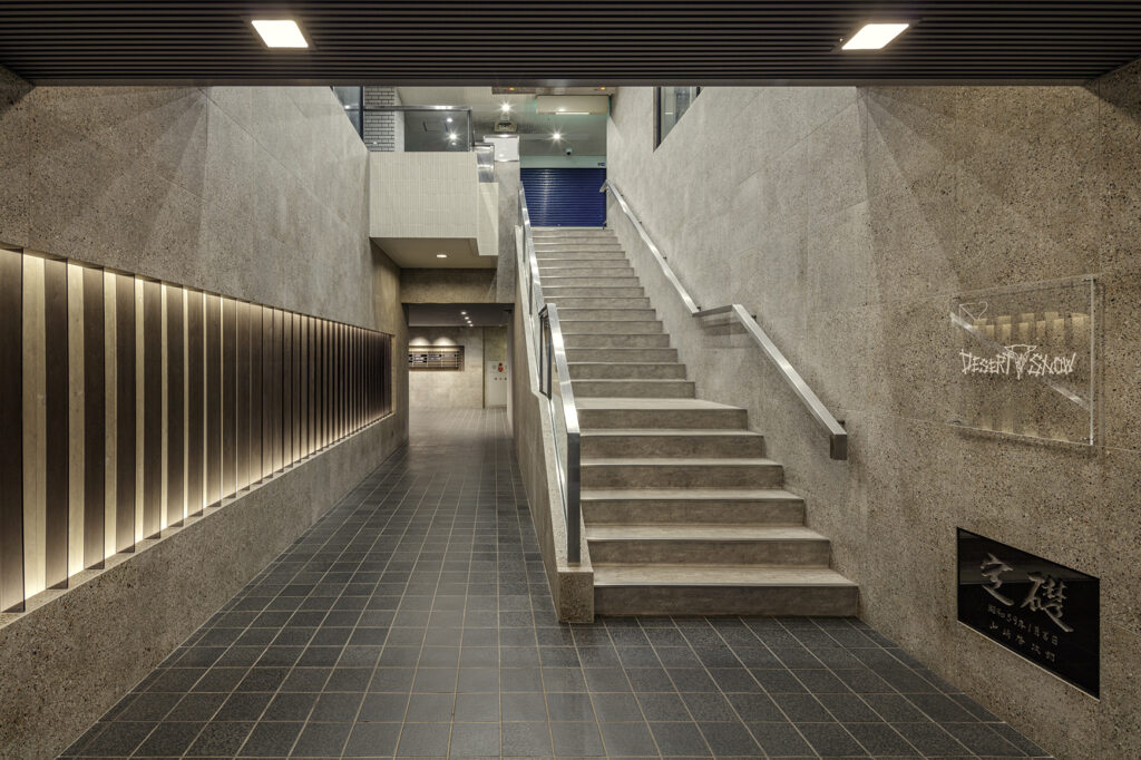
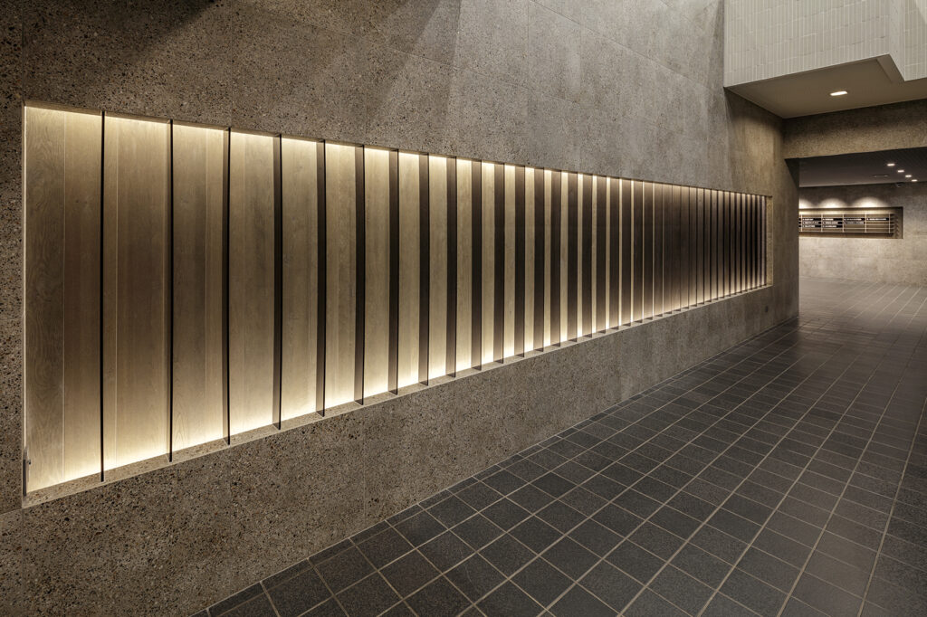
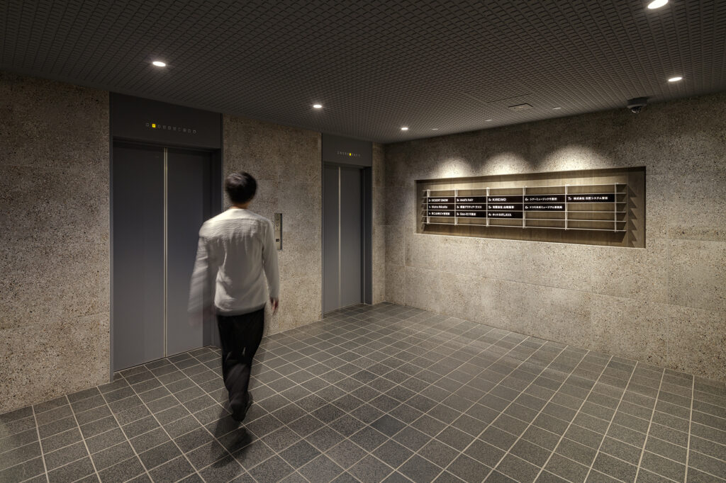
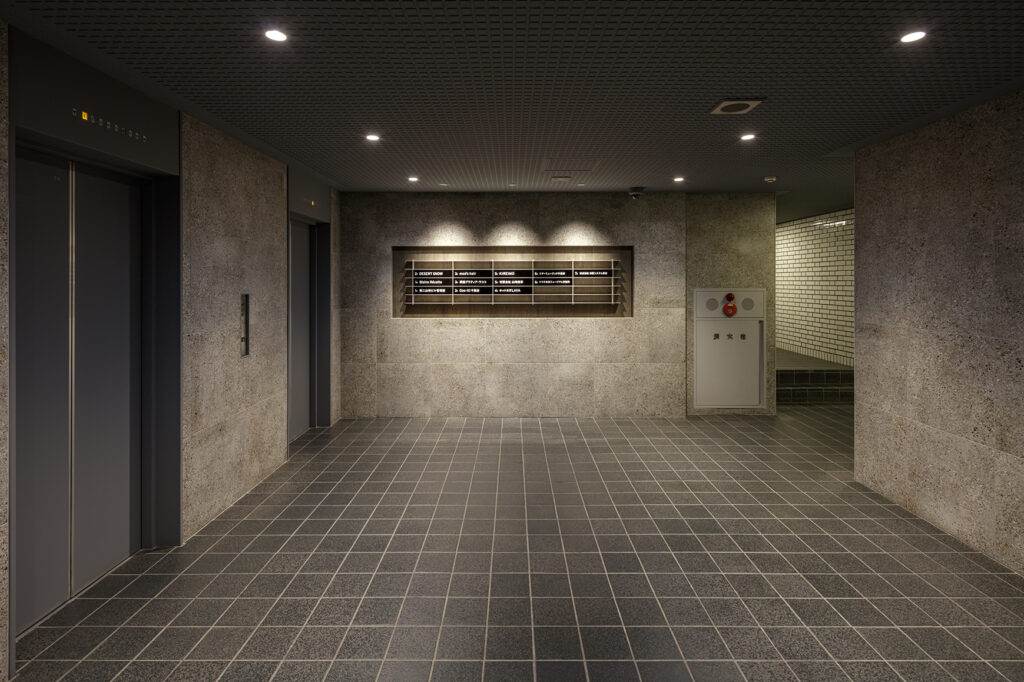
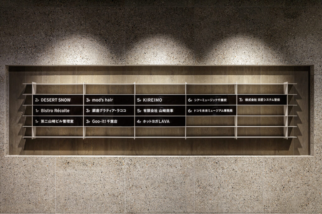
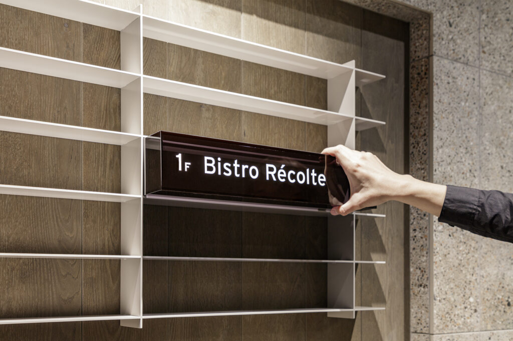
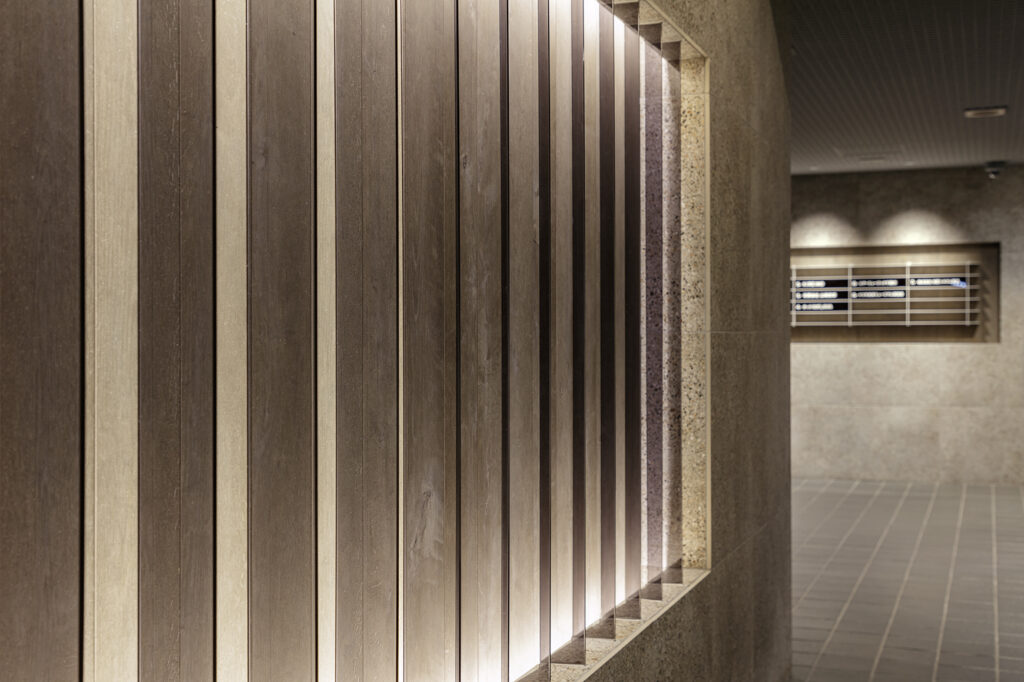
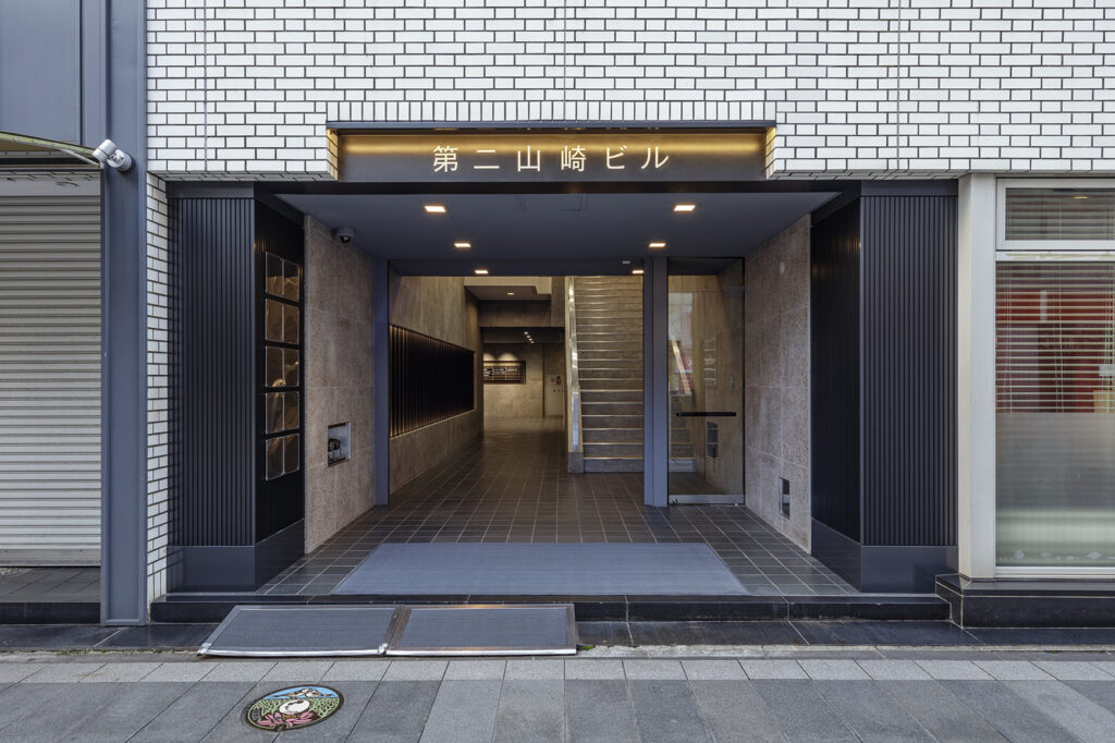
Renovation of the entrance and elevator hall of a building located within walking distance of Chiba Station. Before the renovation, the white tiles applied to the exterior of the building were pulled into the interior from the entrance, creating a minimalist design with a sense of unity. After many years, however, the sophisticated impression had faded, and the entranceway had become bland, dim, and cold. The client asked us to design a space that would make visitors to the building, which also houses a yoga studio and beauty salon, feel at ease. The client wanted the building to stand out from the busy street. We created a solid black gateway to the street as a boundary with the existing exterior tiles, and covered the entire interior from the entrance with mainly terrazzo magnetic tiles. As a key element of the staging, we also designed a bold 7.8m wide design wall on the wall surface while utilizing the original shape of the wall surface. Indirect lighting and black clear louvers give the space an eye-catching effect that changes dramatically depending on the angle and distance from the viewer. With the aforementioned design wall on the side, we are led to the elevator hall. The elevator hall, which had been complicated by many elements, was simplified and completely refurbished, and a new floor sign was planned to be integrated with it. The floor sign is a box-shaped sign box inserted into a steel grid shelf. The shelves, the only furniture element in the space, become the main feature of the hall and appear in front of visitors. This project was like designing the boundary between the existing building design and the part to be redesigned in the renovation project. We were torn between what to keep and what to change, and eventually we felt that we had achieved a cohesive whole.